Visualization Gallery
Visualizations created by the DSRS Team using Tableau with the 1% datatset.
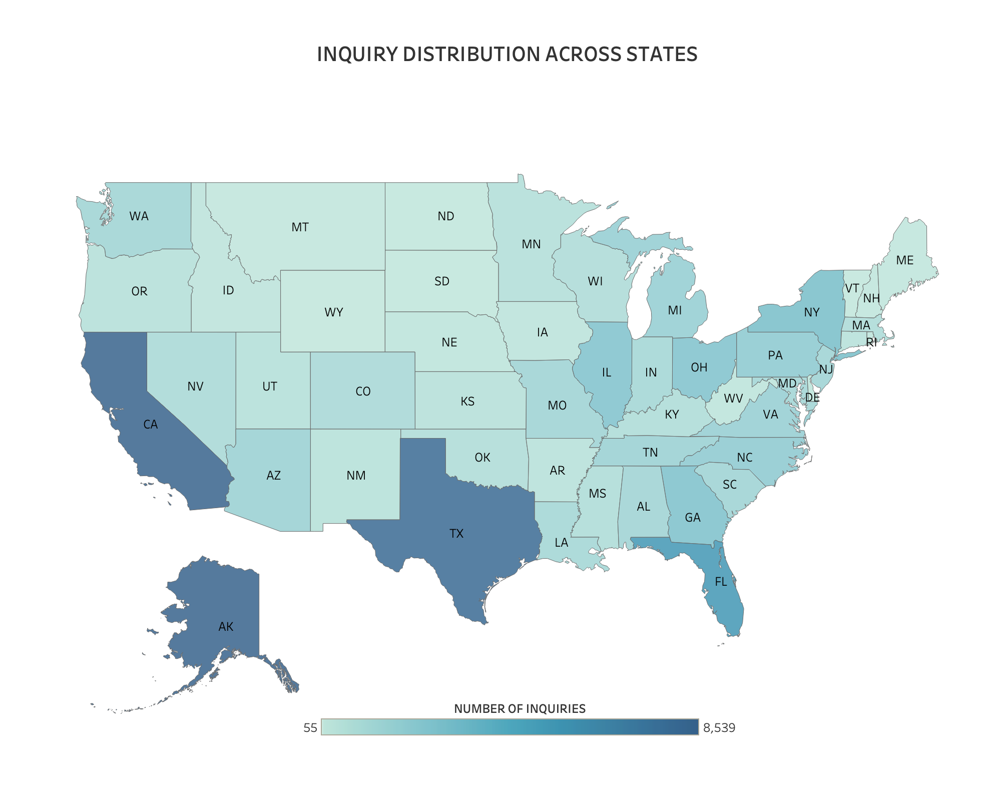
1. Inquiry Distribution Across States
Description:
Description:
The map visualization illustrates the distribution of inquiries across states using data from the inquiries_10pct table within the clarity schema. It displays the number of inquiries made in each state, highlighting variations in inquiry volumes.
Key Insights:
- California and Texas exhibit high inquiry volumes, while Wyoming and Vermont show lower activity.
- The Color Gradient visually represents inquiry volumes, with darker shades indicating higher numbers and lighter shades indicating lower numbers.
- This visualization offers a geographical overview of inquiry distribution, facilitating regional analysis and providing insights into the demand and activity levels across states.
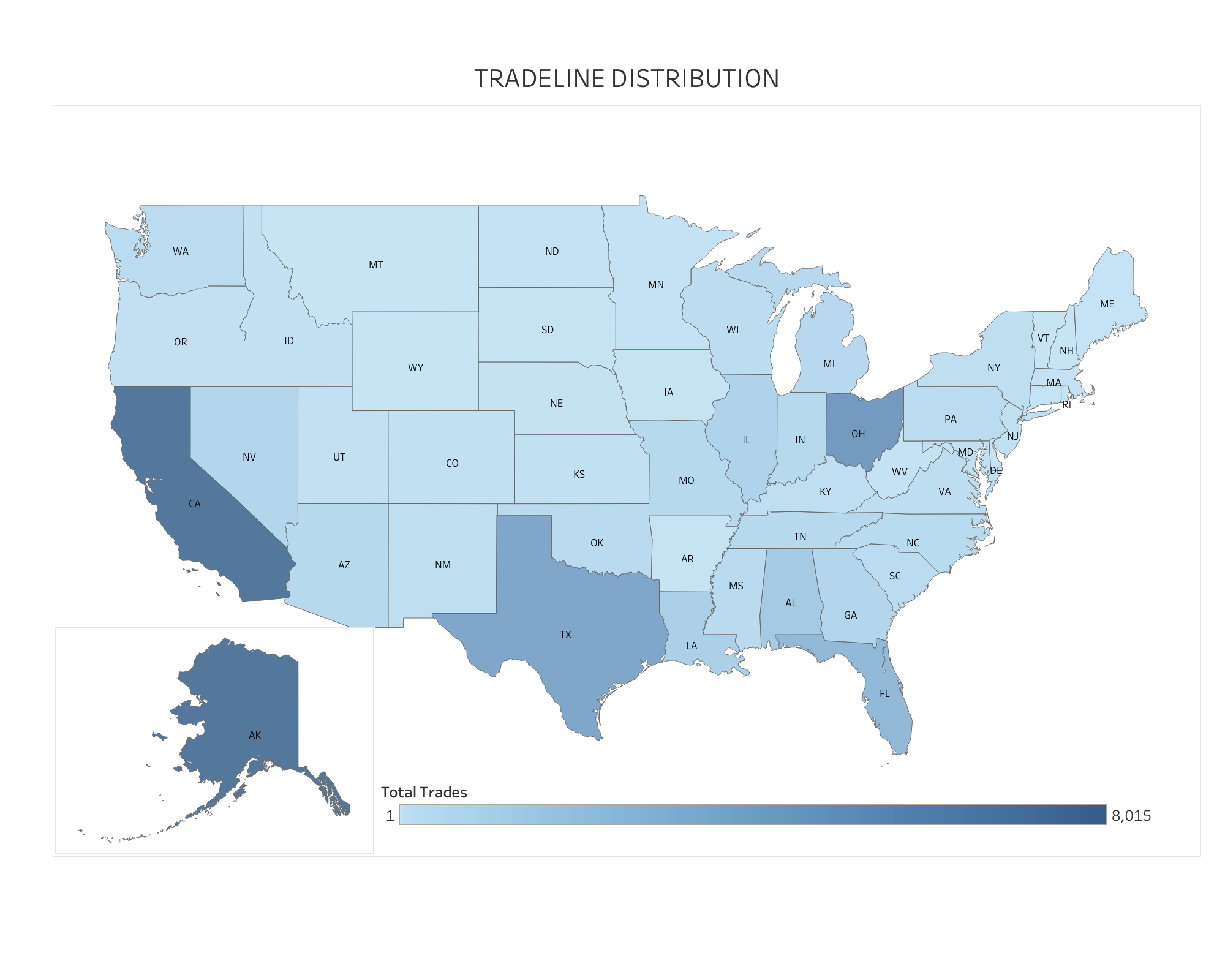
2. Tradeline Distribution Across States
Description:
The map visualization utilizes data from the tradelines_10pct table within the clarity schema. It depicts the distribution of tradelines across the United States by state, displaying the total number of trades in each state.
Key Insights:
- States like California, Texas, and Ohio exhibit a higher number of tradelines, suggesting elevated activity or larger sample sizes in these regions.
- Conversely, states such as Wyoming and Vermont show fewer tradelines, represented by lighter shades.
- The Color Gradient visually represents inquiry volumes, with darker hues indicating higher numbers and lighter hues indicating lower numbers.
- This visualization offers a geographical overview of tradeline distribution, facilitating regional analysis.
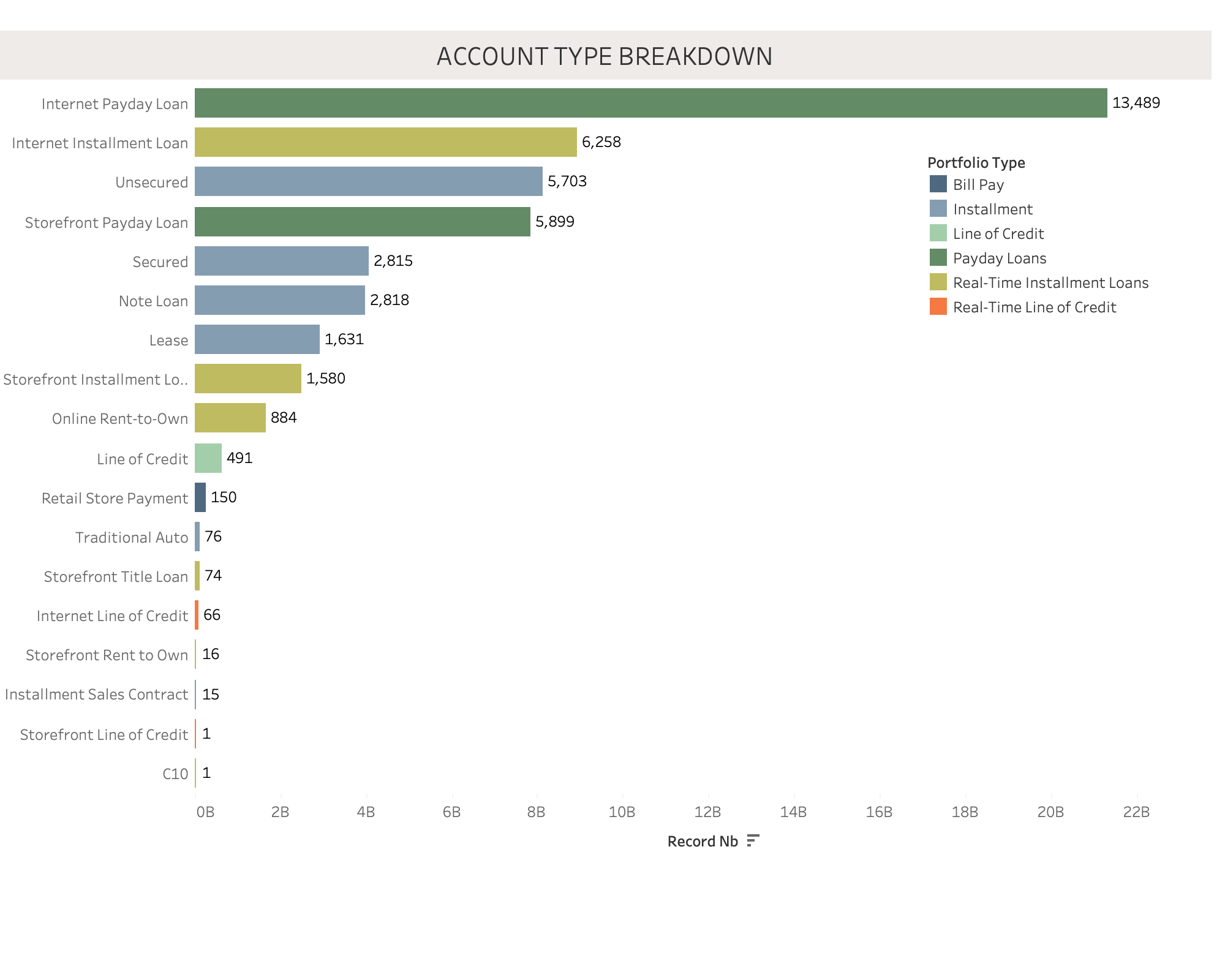
3. Breakdown of Account Type
Description:
The bar chart visualization is based on data from the tradelines_10pct table within the clarity schema. It presents a breakdown of account types by record number.
Key Insights:
- The largest category, Internet Payday Loan, comprises 13,489 records.
- Other significant categories include Internet Installment Loan with 6,258 records and Storefront Payday Loan with 5,899 records.
- This visualization offers a clear overview of the distribution of account types based on their respective record counts.
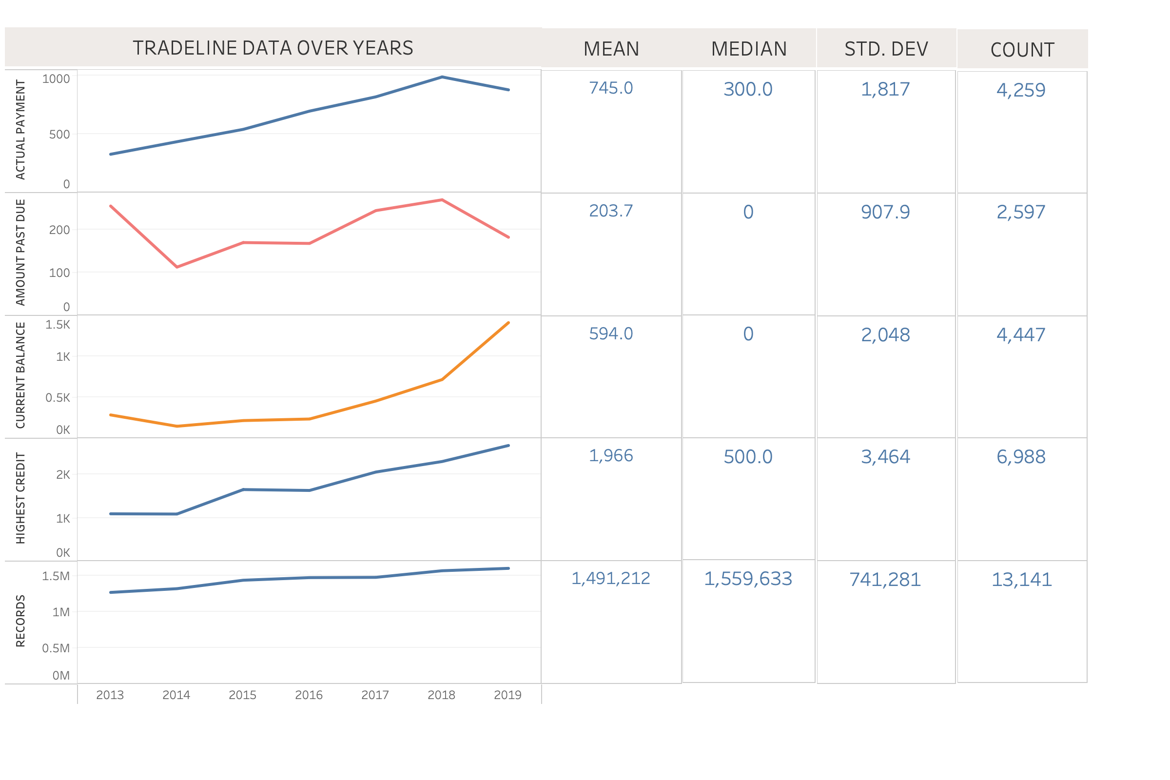
4. Tradeline Data Over Years
Description:
The line chart visualization utilizes data from the tradelines_10pct table within the clarity schema. It tracks various metrics from 2013 to 2019, providing statistical summaries for each metric.
Key Insights:
- Actual Payment: Shows a steady increase overall but a decline in the last two years.
- Amount Past Due: Exhibits fluctuations with a general decreasing trend.
- Current Balance: Demonstrates a significant increase starting from approximately 2017.
- Highest Credit: Displays a consistent upward trend.
- Records: Indicates consistent growth throughout the observed years.
- This visualization offers a comprehensive view of how these key financial metrics have evolved over time, facilitating detailed trend analysis.
5. Account Status Overview
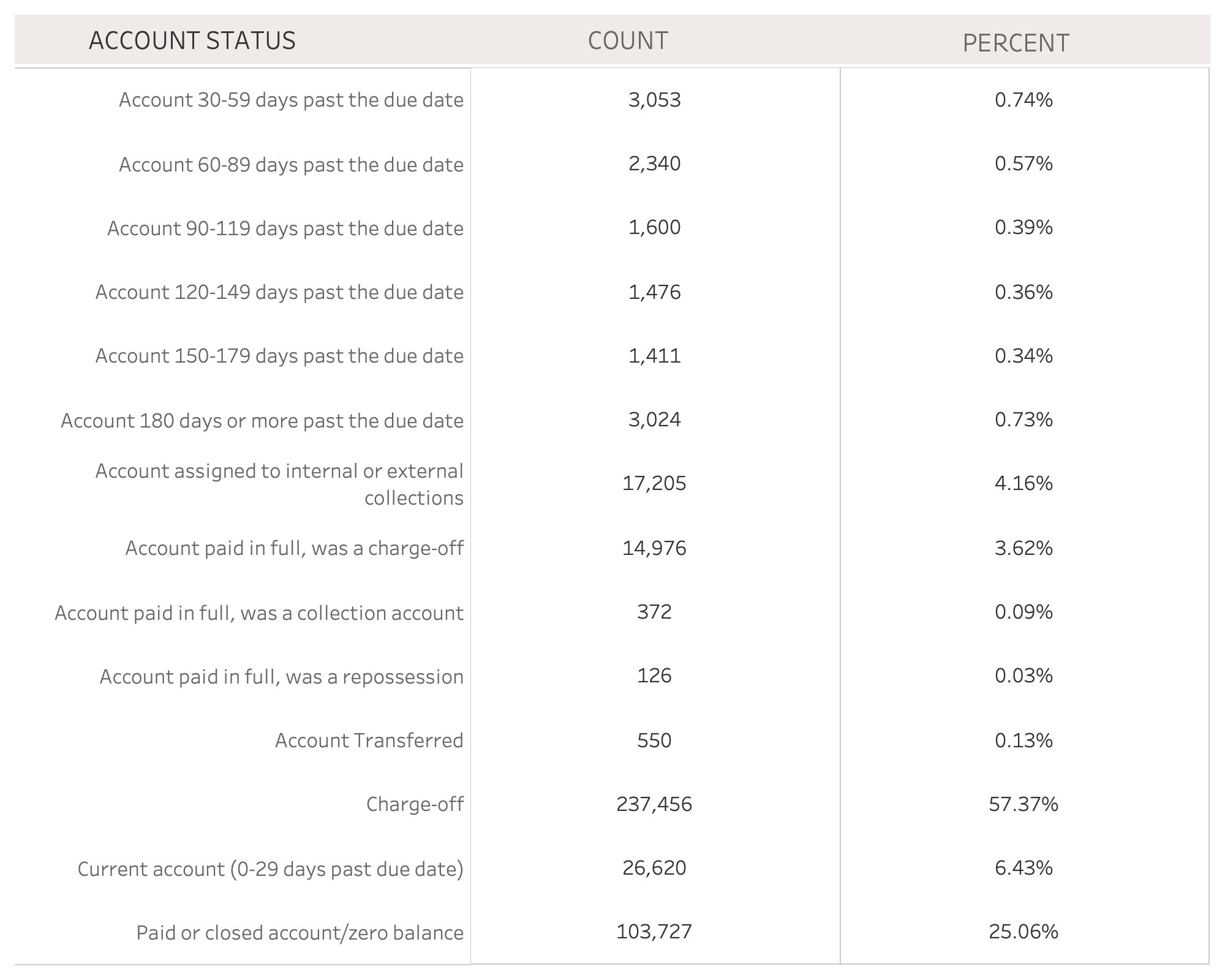
Description:
The table visualization is based on data from the tradelines_10pct table within the clarity schema. It categorizes various account statuses, detailing the count and percentage distribution for each category.
Key Insights:
- Charge-off Accounts: Representing 57.37% of total accounts, indicating a high level of delinquency.
- Current Accounts (0-29 days past due): Account for 6.43%, indicating minimal overdue payments.
- Paid or Closed Accounts: Representing 25.06%, these accounts indicate settled statuses.
- This visualization provides a concise overview of account health and risk, highlighting the distribution of different account statuses based on their counts and percentages.